Apple has released iPhones in numerous aspect ratios since 2007, including 3:2, 9:16, 16:9, 17:9, and 19.5:9. The iPhone screen size has increased from the original 3.5 inches in 2007 up to 6.7 inches today, with many different resolutions over the years. Aspect ratio is an important consideration for developing iPhone apps that adapt well across various models.
URL: https://vietrace365.vn/redirect/?url=https://vm0cnrnr43.%D0%B0%D1%82%D0%B5%D0%BB%D1%8C%D0%B5-%D0%BC%D0%BE%D0%B4%D0%B8%D1%81%D1%82%D0%BA%D0%B0.%D1%80%D1%84
Understanding Aspect Ratios
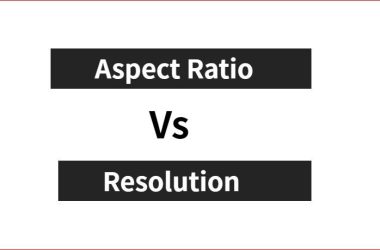
The aspect ratio of a display is the proportional relationship between its width and its height. It is expressed as two numbers separated by a colon (x:y). For example, an aspect ratio of 16:9 means the display is 16 units wide for every 9 units in height.
Aspect ratios are important when designing apps for different iPhone models because the screens come in different rectangular shapes. The original iPhone models used a 3:2 aspect ratio. However, since the iPhone 5, most newer models use the widescreen 16:9 aspect ratio. There are also taller aspect ratios on some recent models like 19.5:9 or 21:9.
Understanding the different aspect ratios allows developers to optimize the user interface and layout for each device. Apps designed for one aspect ratio may have issues displaying properly on a different shaped screen.
(https://en.wikipedia.org/wiki/Display_aspect_ratio)
Common iPhone Aspect Ratios
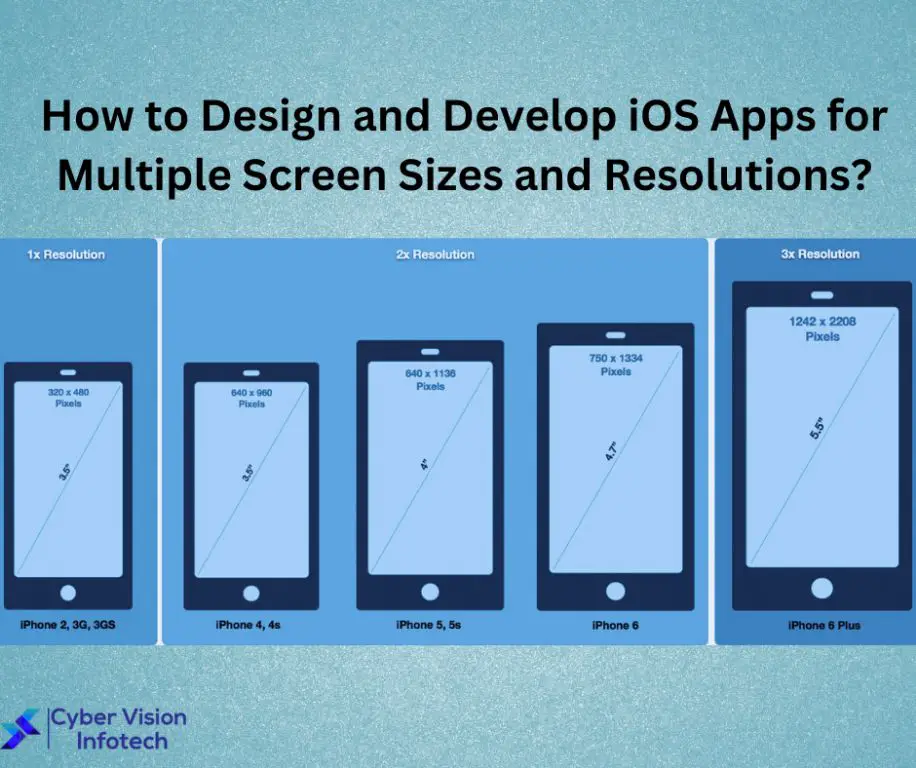
There are a few key aspect ratios that developers need to design for when building apps for iPhones (Resolution by iOS device):
The iPhone 13 mini, iPhone 13, iPhone 14, and iPhone 14 Plus use a 19.5:9 aspect ratio. This taller, narrower aspect ratio allows for more vertical space and is well-suited to displaying content like text and photos (Measuring up – reference table for iOS device dimensions).
Older iPhone models like the iPhone 8 use a 16:9 aspect ratio, which is more similar to an HDTV. This wider aspect ratio provides more horizontal space for landscapes and gameplay.
The iPhone X, XS, 11 Pro, 12 mini, and 13 Pro models use a 19.5:9 aspect ratio but at a different resolution than the iPhone 13 and 14 models. Developers need to account for these variations.
Finally, the iPhone 6, 6S, 7, and 8 Plus use a 16:9 aspect ratio but at lower resolutions than newer iPhones. Developing for multiple aspect ratios and resolutions is key for compatibility.
Adaptive UI Design
Adaptive UI design focuses on adapting a UI to multiple screen sizes and devices (Adaptive UI Design Powered by AI and Machine Learning). Rather than just making elements resize to fit different screens like responsive design, adaptive design detects the screen size and device and changes the layout and elements to optimize for that specific viewport. Some key advantages of adaptive design include:
- Optimized UI for every screen size – The UI is tailored for each screen size rather than just resized.
- More consistent user experience – Core pages and flows can stay the same across devices rather than change drastically.
- Efficient development – Less need to design multiple page variations for different breakpoints.
There are a few techniques that enable adaptive UI design including Auto Layout, Size Classes, and Dynamic Type in iOS development (Responsive vs. Adaptive UI Design for Unforgettable User Experiences!). These allow developers to define rules and constraints that let the app determine how to optimize the layout for the current device and screen size.
Auto Layout
Auto Layout is an essential tool for building adaptive user interfaces that work across multiple iPhone aspect ratios. With Auto Layout, you define rules and constraints that determine how UI elements should be laid out within a view. This allows the system to calculate the size and position of elements dynamically based on the available space.
There are two main ways to implement Auto Layout:
- Using Interface Builder – you can define your constraints visually using the graphical editor.
- Programmatically – you define your constraints in code.
Programmatic Auto Layout tends to provide more flexibility and control, especially for complex interfaces (Source). With code, you can create and activate constraints in response to size class changes, trait collections, and other dynamic factors.
Planning your Auto Layout constraints is an important first step. Think about how your UI needs to adapt and which elements should remain sized or positioned proportionally. Map out the necessary constraints before implementing them in code (Source).
Properly configured Auto Layout rules allow your app’s UI to dynamically adapt to different iPhone sizes and orientations. This provides a polished experience across multiple aspect ratios.
Size Classes
Size classes in iOS allow developers to design adaptive user interfaces that dynamically respond and adapt to different device sizes and orientations (Bambara, 2015). Instead of manually designing for specific devices and orientations, you can leverage size classes to build interfaces that intelligently adapt according to horizontal and vertical size classes.
There are two size class traits – Regular and Compact. Regular horizontal corresponds to an iPad in landscape orientation, while Compact horizontal corresponds to an iPhone in portrait. For vertical, Regular corresponds to an iPad or iPhone in portrait orientation, while Compact vertical corresponds to landscape orientation on those devices (Hillegass & Conway, 2017).
By combining vertical and horizontal size classes, you can create adaptive layouts and constraints that dynamically respond as needed. For example, an iPad in landscape would be Regular horizontal and Compact vertical. An iPhone in portrait would be Compact horizontal and Regular vertical. This allows you to build interfaces optimized for those combinations once, rather than manually designing each layout.
Overall, leveraging size classes is a powerful way to build adaptive apps that provide optimal UI and UX across varying iPhone aspect ratios and orientations.
Dynamic Type
Dynamic Type allows apps to dynamically adapt text sizes based on the user’s selected text size preference in iOS Settings. This provides an optimal reading experience tailored to each user’s needs and preferences (Martínez-Cuevas).
To support Dynamic Type, use the preferredFont(forTextStyle:) method to get the user’s preferred font for a given text style. Then set the font on your UILabels, UITextViews, etc. to automatically resize based on the user’s settings (Curtis). You can also use the adjustedFont(forTextStyle:) method to get a font adjusted for the current trait collection.
Additionally, optimize line height, line width, margins and other typographic details for readability at various text sizes (DesignCode). With proper implementation, your app’s text will gracefully adapt as users customize their desired reading experience.
Testing
When developing apps for multiple iPhone aspect ratios, it is crucial to thoroughly test your app on the different screen sizes to ensure proper UI adaptation. According to an article on Stack Overflow, using a resizable simulator view is an effective way to test on different iPhone screen sizes without needing to acquire every device. Tools like Screen Sizes Simulator allow you to dynamically resize a simulator view to confirm your app’s UI correctly adapts to different aspect ratios and screen sizes.
Be sure to test on all current and previous iPhone models to cover the common aspect ratios. Focus on testing edge cases and verifying elements rearrange, scale, and reflow as expected. Testing on real devices is ideal, but simulator testing can sufficiently validate UI adaptations if devices are limited.
Submission Tips
When submitting your app to the App Store, it’s important to optimize your screenshots and previews for the various iPhone aspect ratios. According to the App Store screenshot size guidelines, you’ll need to provide screenshots for 4.7″, 5.5″, and 6.5″ displays. Make sure to capture your app running on physical devices with those screen sizes. Make screenshots for each aspect ratio portraying the same core content. Also submit app previews showing your app’s key user flows.
Tailor your app description and keywords for each aspect ratio. Research popular keywords using App Store data. Services like AppTweak provide keyword optimization tools for the App Store. Include relevant keywords for your target users and the different iPhone sizes.
Test your listing with different Apple IDs to ensure optimization. Make revisions based on conversion rates, impressions, and downloads. Aim for at least a 30% conversion rate from product page views to installs.
Conclusion
Designing apps to support multiple iPhone aspect ratios requires careful planning and implementation. Here are some key takeaways:
-
Understand the most common iPhone aspect ratios – 4.7″, 5.5″, 5.8″ and 6.7″.
-
Leverage adaptive UI design principles and Auto Layout to build interfaces that dynamically adapt across aspect ratios.
-
Utilize size classes to optimize layouts for different size screens.
-
Implement Dynamic Type to scale text appropriately on all screen sizes.
-
Thoroughly test your app on various iPhone models to ensure proper support.
-
Carefully follow App Store submission guidelines for screenshots and previews.
By considering these key points, you can build an iPhone app with a polished UI that works seamlessly across the range of available aspect ratios.

